
MLB
MLB Team Logo: A Complete Guide to the Iconic Symbols of America’s Pastime
Jul
Baseball logos are more than just simple designs they’re the visual heartbeat of MLB team identity and represent decades of tradition, passion, and fan loyalty. From the classic interlocking NY of the Yankees to the distinctive “B” of the Boston Red Sox, these MLB Team Logo designs have become cultural icons that transcend the sport itself.
Whether you’re a lifelong fan looking to showcase your team pride or a collector seeking authentic merchandise, understanding the rich history and meaning behind MLB team logos adds depth to your appreciation of America’s pastime. These symbols carry the weight of championship victories, heartbreaking defeats, and countless memories shared by millions of fans across generations.
The Evolution of MLB Team Logos Through History
The history of MLB team logos dates back to the early 1900s when teams first began incorporating distinctive visual elements into their uniforms and marketing materials. Initially, most teams relied on simple letter designs or basic emblems, but as the sport grew in popularity, so did the sophistication of their visual identities.
The 1950s marked a turning point in logo design as teams began working with professional designers to create more memorable and marketable symbols. This era saw the birth of many iconic designs that remain largely unchanged today, including the Detroit Tigers’ Old English “D” and the St. Louis Cardinals’ distinctive bird-on-bat logo.
Modern MLB logos have evolved to balance tradition with contemporary design principles. Teams carefully consider color psychology, typography, and cultural significance when updating their visual identity, ensuring that changes honor their heritage while appealing to new generations of fans.
![]()
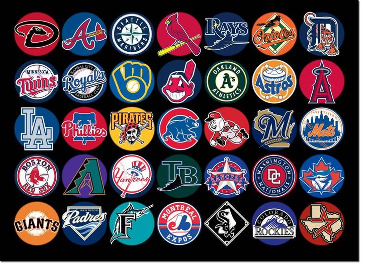
Most Iconic MLB Team Logos and Their Meanings
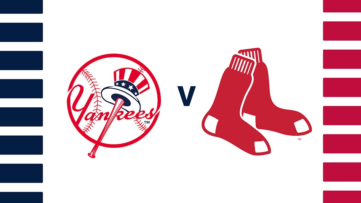
New York Yankees – The Interlocking NY
The New York Yankees logo is arguably the most recognizable symbol in all of professional sports. The interlocking “NY” design was first introduced in 1909 and has remained virtually unchanged for over a century. This logo represents not just a baseball team, but a symbol of New York City itself and has become synonymous with excellence and championship success.
The logo’s enduring appeal lies in its simplicity and elegance. The navy blue lettering on a white background creates a timeless look that translates perfectly across all merchandise, from Yankees apparel to collectible items.
Boston Red Sox – The Hanging Socks
The Boston Red Sox logo features a pair of red socks hanging from a baseball bat, directly referencing the team’s name. This playful yet traditional design has been a cornerstone of the franchise since the 1970s, though the team has used various iterations throughout its history.
The logo perfectly captures the team’s New England heritage while maintaining a fun, approachable aesthetic that resonates with fans of all ages. The red and navy color scheme has become iconic in its own right, instantly recognizable to baseball fans worldwide.
Los Angeles Dodgers – The Scripted LA
The Los Angeles Dodgers logo features an elegant script “LA” that embodies the sophisticated, Hollywood glamour associated with the city. The flowing letterforms and royal blue color create a sense of movement and grace that reflects the team’s West Coast identity.
Since moving from Brooklyn in 1958, the Dodgers have maintained this clean, professional look that appeals to their diverse fanbase. The logo works equally well on traditional baseball caps and modern lifestyle merchandise.
Regional Variations and Cultural Influences in MLB Logos
MLB team logos often reflect the unique cultural and geographical characteristics of their home cities. Teams like the Seattle Mariners incorporate nautical themes with their compass-inspired design, while the Colorado Rockies feature mountain imagery that speaks to their Rocky Mountain location.
The influence of local culture extends beyond geography to include historical references, indigenous heritage, and regional industries. The Pittsburgh Pirates’ skull and crossbones logo pays homage to the city’s industrial heritage and tough, blue-collar identity.
Teams in markets with strong Hispanic populations, such as the San Diego Padres and Miami Marlins, have incorporated cultural elements that resonate with their diverse fanbases. These design choices help create deeper connections between teams and their communities.

The Business Impact of Strong MLB Logo Design
A well-designed logo MLB team serves as the foundation for all merchandise and marketing efforts. Teams with iconic logos consistently rank among the top sellers in licensed merchandise, generating millions in revenue through apparel, accessories, and collectibles.
The Major League Baseball organization recognizes the commercial value of strong visual identity, investing heavily in brand guidelines and licensing programs that protect and promote team logos across all platforms.
Research shows that fans are more likely to purchase merchandise featuring logos they find visually appealing and emotionally meaningful. This connection between design quality and commercial success drives teams to carefully consider every aspect of their visual identity.
Merchandise and Fan Engagement
The popularity of MLB team logos extends far beyond traditional baseball merchandise. Fashion brands regularly collaborate with teams to create lifestyle products that feature iconic logos in contemporary designs. This crossover appeal helps teams reach new audiences while generating additional revenue streams.
Digital platforms have created new opportunities for logo visibility and engagement. Social media profiles, mobile apps, and streaming services all rely on clear, recognizable logos to maintain brand consistency across various touchpoints.


Logo Design Elements That Make MLB Brands Memorable
Color Psychology in Baseball Logos
The strategic use of color in MLB team logos plays a crucial role in brand recognition and emotional connection. Traditional colors like navy blue, red, and green evoke feelings of stability and tradition, while teams like the Miami Marlins use vibrant oranges and teals to convey energy and modernity.
Color choices often reflect team history and local culture. The San Francisco Giants’ orange and black color scheme pays tribute to the city’s unique fog-covered landscape and distinctive architecture.
Typography and Letterform Design
The typography used in MLB logos ranges from classic serif fonts to custom hand-lettered designs. Teams like the Detroit Tigers use Gothic-inspired letterforms that convey strength and tradition, while others opt for more contemporary sans-serif approaches.
The scale and proportion of lettering elements must work effectively across various applications, from massive stadium signage to small social media avatars. This versatility requirement influences every aspect of the design process.
Controversial Logo Changes and Fan Reactions
When teams attempt to modernize their logo MLB team designs, they often face intense scrutiny from passionate fanbases. The history of logo changes in baseball is filled with both successful updates and controversial missteps that required quick reversals.
The Seattle Mariners’ transition from their original trident logo to the current compass design took several iterations before finding the right balance between tradition and innovation. Fan feedback played a crucial role in shaping the final design that honors the team’s maritime heritage.
Teams must carefully balance the desire for modernization with respect for tradition. Successful logo updates typically involve subtle refinements rather than wholesale changes, allowing teams to stay current while maintaining their visual heritage.
Case Study: Cleveland Guardians Rebrand
The Cleveland Guardians’ recent name and logo change represents one of the most significant rebranding efforts in recent MLB history. The team worked extensively with community stakeholders and design professionals to create a new identity that honors local landmarks while building a fresh foundation for the future.
The process demonstrated the complexity of modern sports branding, involving legal considerations, cultural sensitivity, and extensive market research. The resulting logo successfully incorporates Cleveland’s architectural heritage while creating a distinctive mark for the franchise.

Collecting MLB Logo Merchandise and Memorabilia
For collectors and fans, MLB team logos represent more than just team identity they’re windows into baseball history and culture. Vintage items featuring classic logo designs have become highly sought-after collectibles, with some pieces commanding premium prices at auctions and specialty shops.
The appeal of logo-based merchandise extends across generations, with older fans seeking items that remind them of their childhood heroes and younger fans discovering the timeless appeal of classic designs. This cross-generational interest helps maintain the commercial viability of vintage logo reproductions.
Presentpedia offers an extensive collection of authentic MLB logo merchandise, from traditional caps and jerseys to unique gift items that celebrate your favorite team’s visual identity.
Authentication and Quality Considerations
When purchasing MLB logo merchandise, it’s essential to verify authenticity through official licensing marks and authorized retailers. Counterfeit items not only lack the quality of genuine products but also fail to properly represent the careful design work that goes into official team logos.
High-quality licensed merchandise uses accurate colors, proper proportions, and durable materials that maintain the integrity of the logo design through regular use and washing. These factors contribute to both the aesthetic appeal and longevity of logo-based products.

The Future of MLB Logo Design
As technology continues to evolve, MLB team logos must adapt to new digital environments while maintaining their traditional appeal. The rise of mobile viewing, social media, and virtual reality experiences presents both challenges and opportunities for logo designers.
Future logo designs will need to work effectively across an even wider range of applications, from tiny app icons to massive LED displays. This versatility requirement is driving teams to consider simplified, more geometric approaches that maintain clarity at any size.
The integration of augmented reality and interactive digital experiences may also influence how teams approach logo design, potentially incorporating elements that respond to user interaction or environmental conditions.
Sustainability and Social Responsibility
Modern MLB logos are increasingly designed with sustainability and social responsibility in mind. Teams are considering the environmental impact of merchandise production and the cultural significance of their visual symbols within their communities.
This holistic approach to branding reflects the growing awareness that sports teams serve as important cultural institutions with responsibilities that extend beyond entertainment value.
Frequently Asked Questions About MLB Team Logos
Which MLB team has the oldest logo design?
The Detroit Tigers Old English “D” logo is one of the oldest continuously used designs in MLB, dating back to 1904. While it has undergone minor refinements over the years, the basic design has remained remarkably consistent for over a century.
How often do MLB teams change their logos?
Most MLB teams maintain their primary logos for decades, with major changes occurring only every 20-30 years on average. Minor updates and refinements happen more frequently, typically every 5-10 years to keep the design contemporary.
What makes an MLB logo valuable for collectors?
Collector value in MLB logo merchandise is typically determined by age, rarity, condition, and historical significance. Items from championship seasons, special events, or featuring discontinued logos often command higher prices.
Can I use MLB team logos for personal projects?
MLB team logos are protected by trademark and copyright laws. Personal, non-commercial use may be permitted under fair use guidelines, but any commercial application requires proper licensing through Major League Baseball.
Conclusion: The Enduring Power of MLB Team Logos
The world of MLB team logos represents a fascinating intersection of sports history, design artistry, and commercial success. These iconic symbols serve as rallying points for millions of fans while generating significant revenue through merchandise and licensing agreements.
From the timeless elegance of the Yankees’ interlocking NY to the playful charm of the Red Sox hanging socks, each logo MLB team design tells a unique story about its franchise’s identity and values. As the sport continues to evolve, these visual symbols will undoubtedly adapt while maintaining their role as the emotional connection between teams and their passionate fanbases.
Whether you’re a collector seeking authentic memorabilia or a fan looking to show your team pride, understanding the rich history and significance behind MLB logos enhances your appreciation of America’s pastime. Visit Presentpedia to explore our comprehensive collection of licensed MLB merchandise and celebrate your favorite team’s iconic visual identity.